LET'S MEET
→


PRODUCT DESIGN
CASE STUDY
The Client
Rivals is a leading digital platform for college sports recruiting news, rankings, and community-driven content. With a nationwide network of school-specific sites, Rivals delivers real-time coverage, in-depth analysis, and active forums where passionate fans and insiders connect. As a long-standing authority in high school and college athletics, Rivals serves a dedicated audience of sports enthusiasts, athletes, and recruiting experts.
The Ask
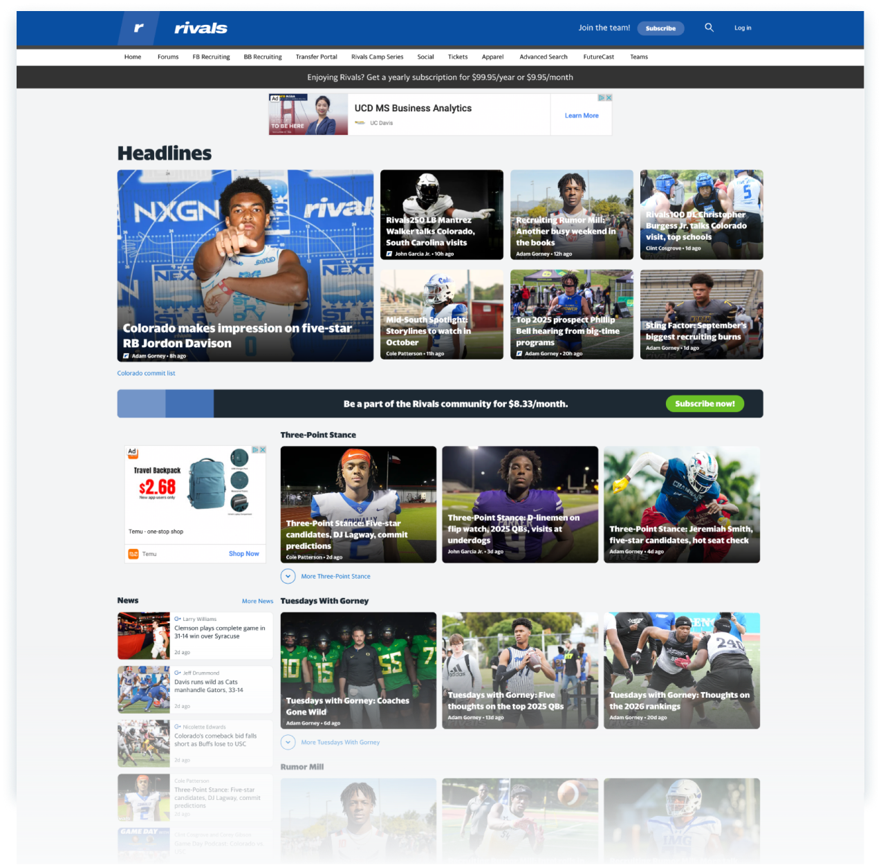
Rivals needed more than a facelift. Years of user data showed drop-offs, poor navigation, and missed opportunities to keep fans engaged. The business wanted a modern platform that could boost retention and open new revenue streams.
Criteria
- Scalable design system for a network of school-specific sites
- Clear definition of core user segments
- Unified and modernized brand identity across experiences
Constraints
- A truncated timeline of 6-months to deliver key pages
- A fast follow rollout of secondary pages to follow
- Lean team of engineers (front and backend) and only one designer.
Jump directly to the solution
SOLUTION
→
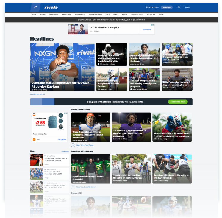
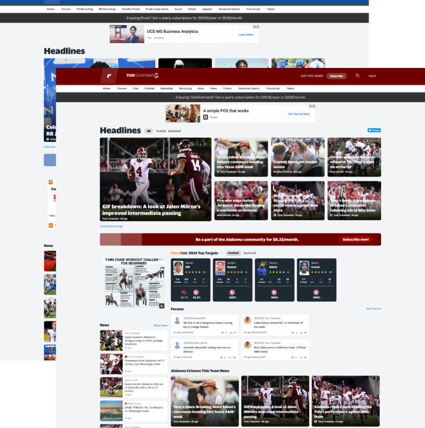
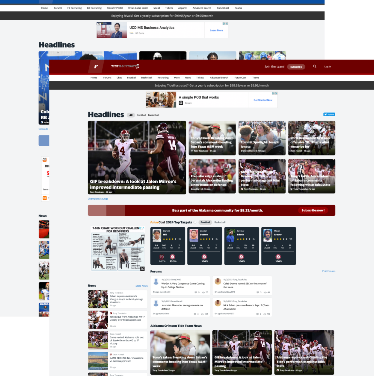
Audit and Analyze
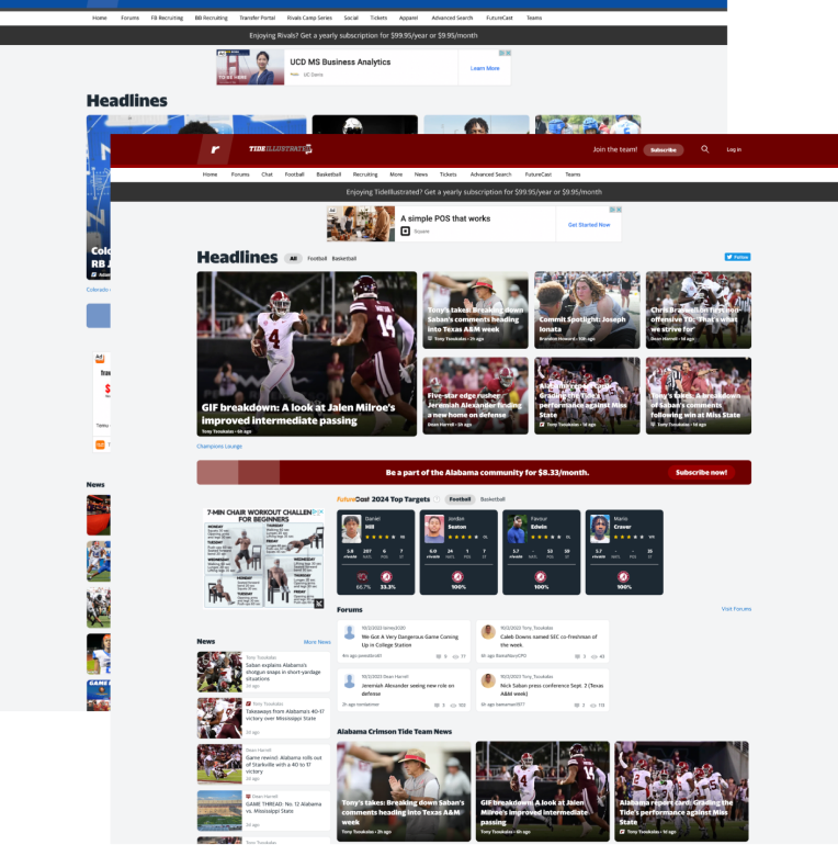
I started by tearing down the existing experience. Usability gaps, clunky flows, and dated visuals all slowed users down. A competitive analysis confirmed what we suspected: Rivals had to evolve or risk losing relevance.
Value
Prevented churn by identifying friction before it cost more users.
Defining a Unified Design Narrative
Forums were the heartbeat of Rivals. I shaped the design narrative around “Join the Rivals Discussion.” Every design decision pointed toward elevating community engagement and making fans feel part of something bigger.
The Narrative
“Join the Rivals Discussion”
Value
Elevated the brand’s status by spotlighting authentic fan culture.


“Join the Rivals Discussion”


The Exploration
With a clear narrative anchored in community-driven engagement, I moved into the exploration phase to translate strategy into tangible design directions. This stage focused on rapid ideation, experimenting with layout systems, visual tone, and interaction patterns that could amplify the energy of real-time conversations. My goal was to balance the urgency and excitement of forum activity with a scalable, brand-aligned system—one that felt dynamic yet structured across devices and screen sizes.
Build to test
I ran A/B tests, prototyped layouts, and captured feedback from both users and stakeholders. The goal was to balance the energy of real-time forums with a system that could scale.
Value
Saved time by testing early and avoiding costly design reversals later.
User Reactions
Our testing revealed that content preferences varied based on user mood and personality, highlighting the importance of offering flexible experiences. However, the stat-driven layout consistently performed better for users seeking quick, glanceable information. Overall, participants favored the streamlined visual hierarchy and ease of navigation, indicating that clarity and content prioritization were key to improving engagement.
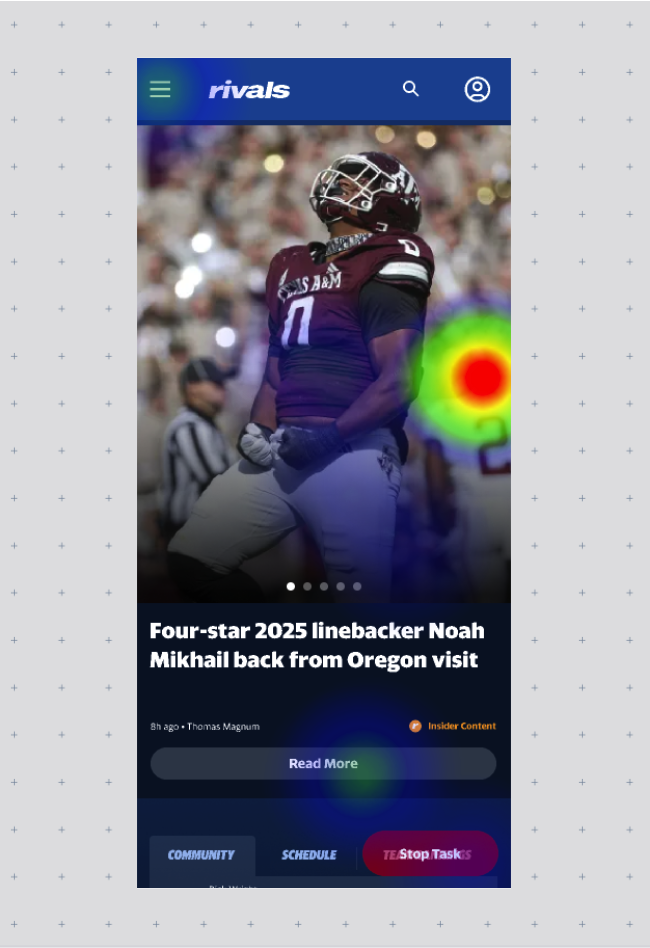
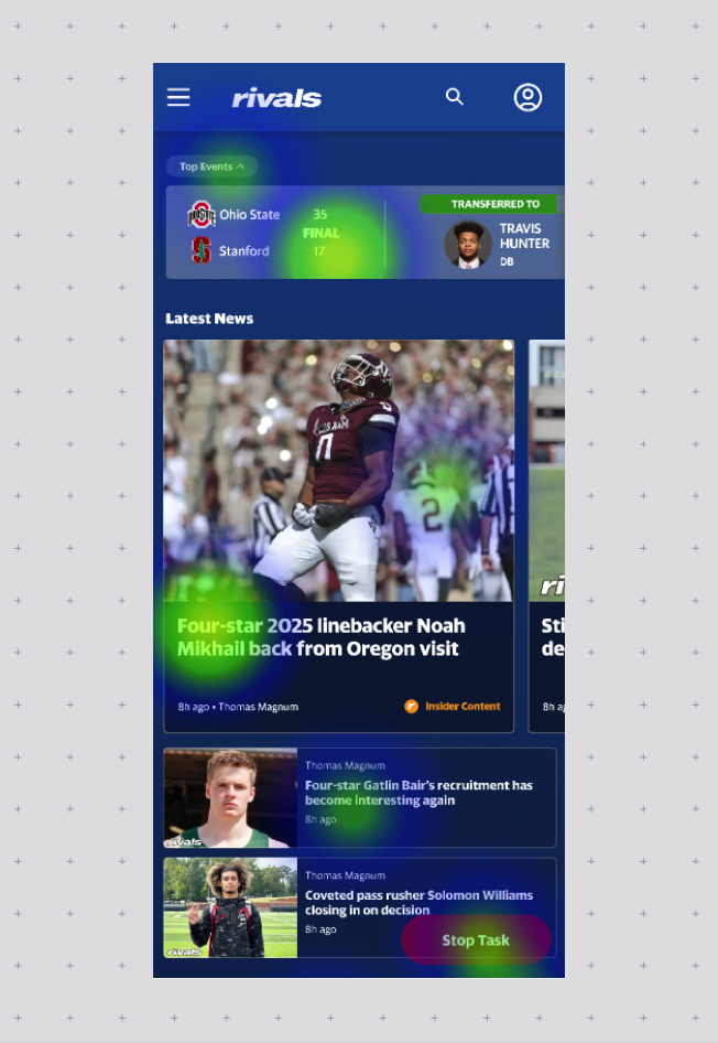
Participant heat maps
Takeaways
- Stat-driven layout was preferred for quick, efficient content scanning
- Article-driven layout appealed more to users in lean-back, in-depth reading modes
- Users appreciated the cleaner structure and improved content hierarchy
- Navigation was rated as more intuitive and user-friendly overall
- Personal preference highlighted the need for flexible entry points to content
- Clear takeaway: prioritizing scannable content supports daily and high-traffic usage
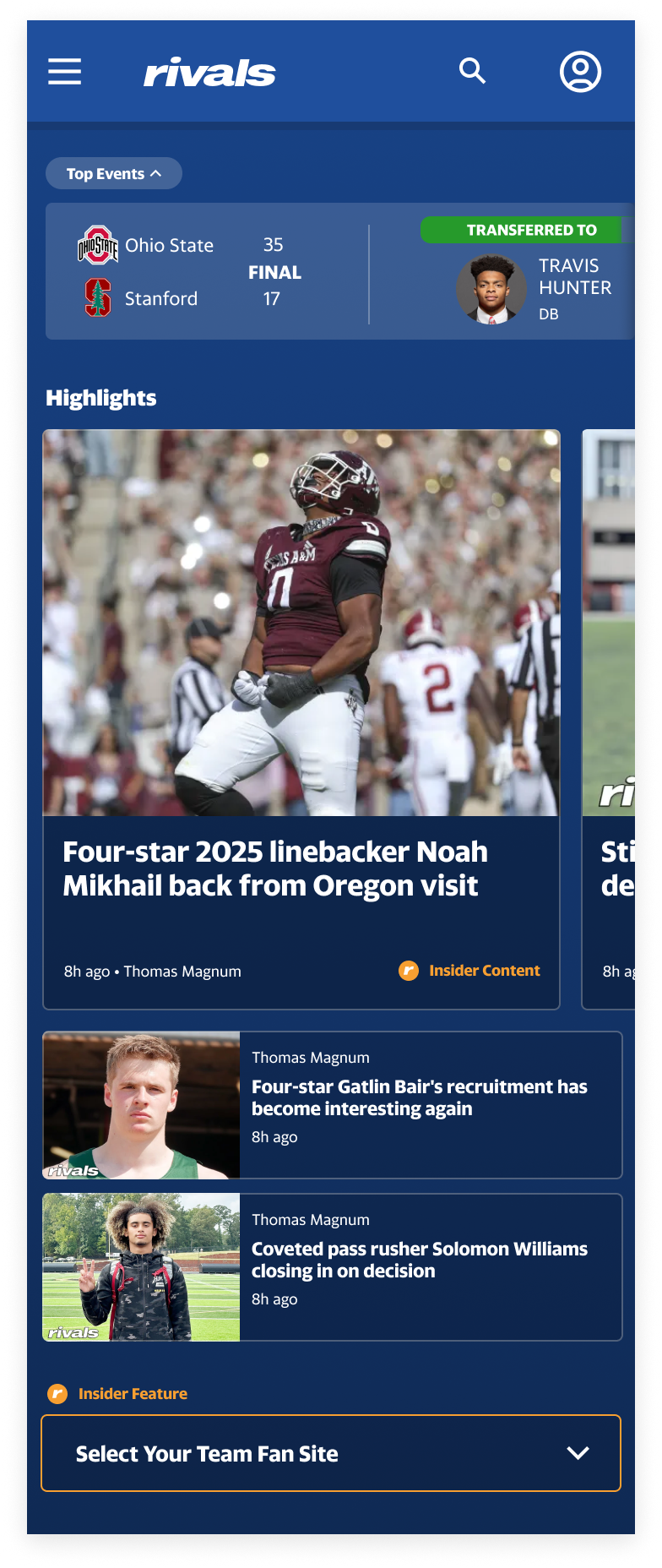
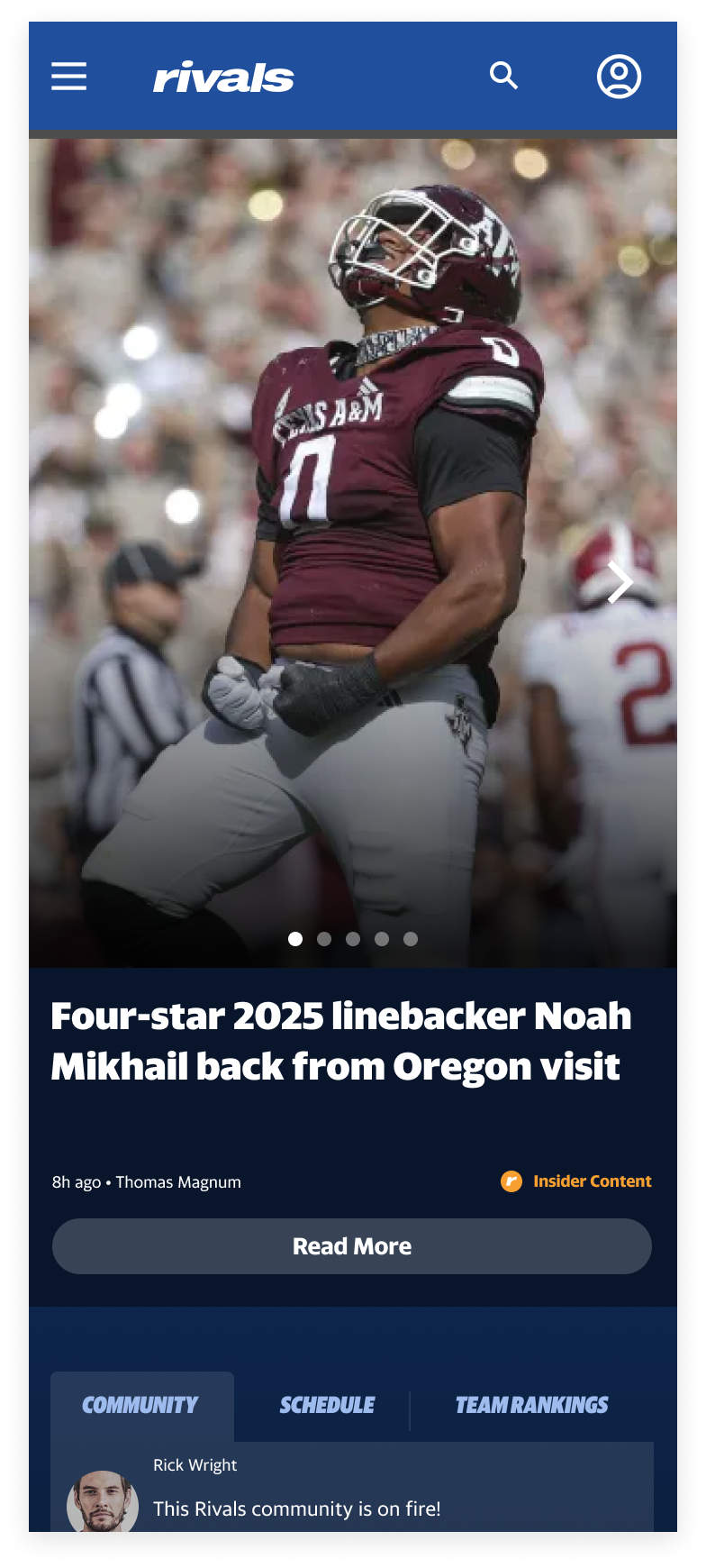
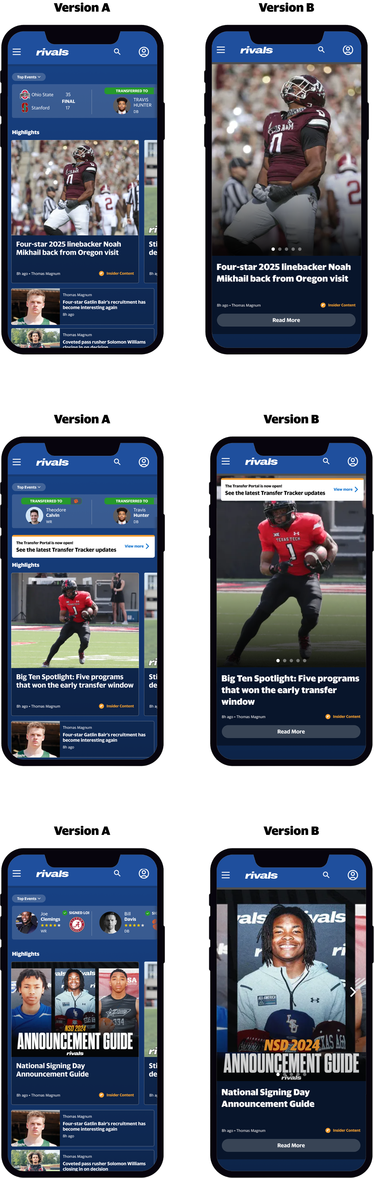
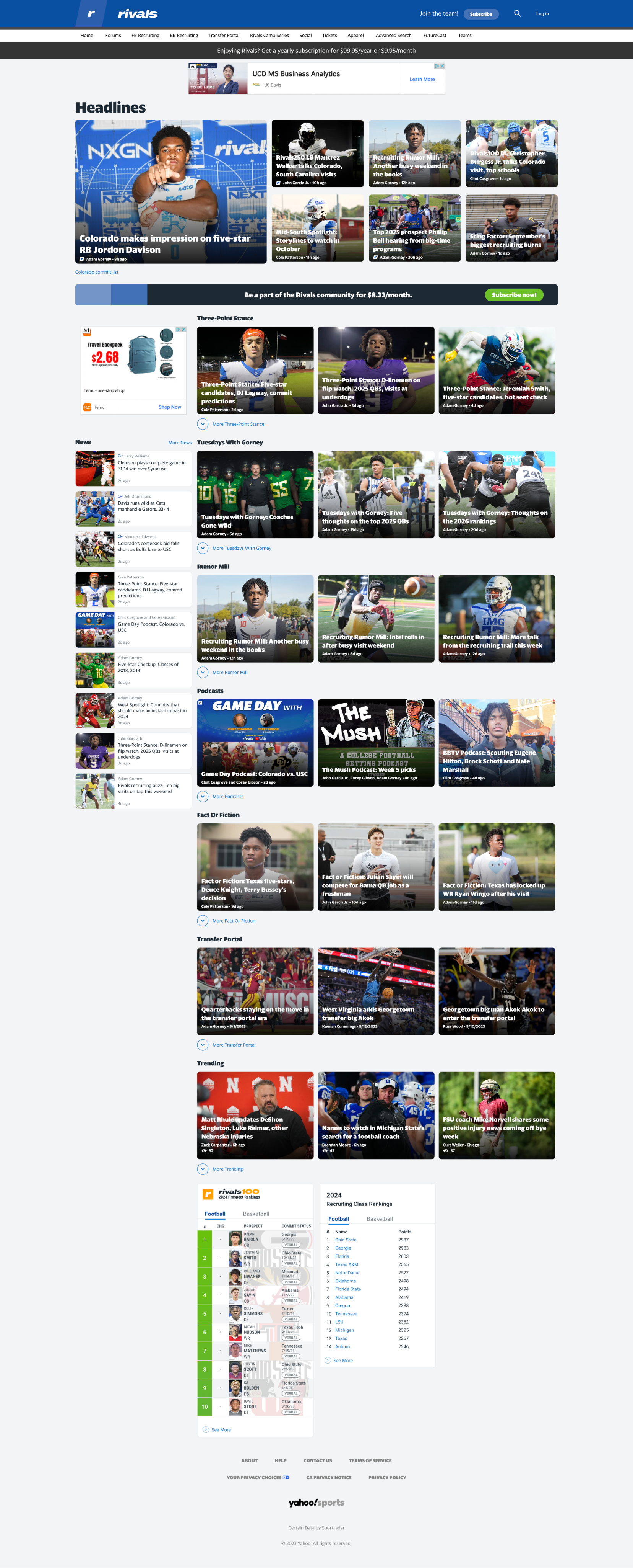
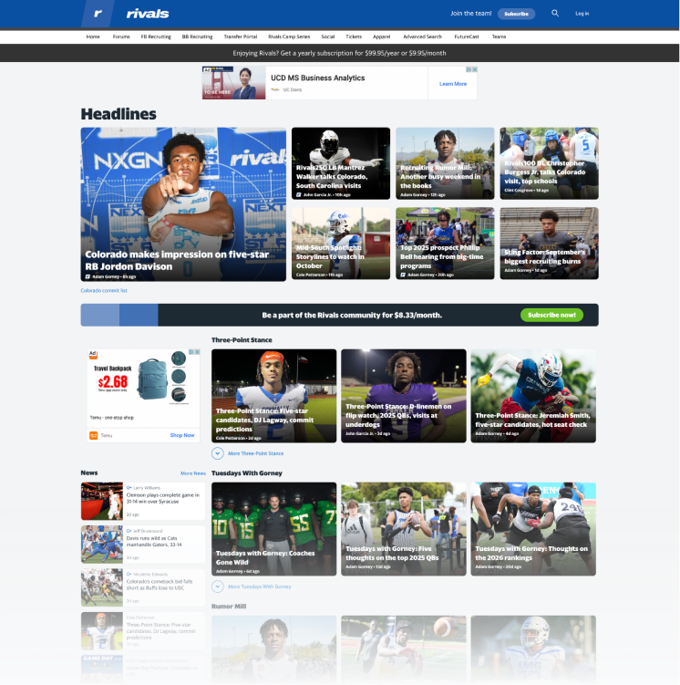
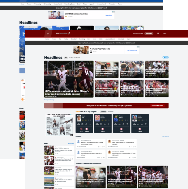
The Solution
The final design introduced a modular, content-forward system. Dashboards highlighted real-time updates, forums became more visible, and editorial tools gave publishers flexibility to tell better stories. An upsell section communicated Rivals’ unique value to new users.
We increased revenue by boosting engagement, ad inventory, and subscriptions.
The Result
The final design, shaped by user testing and community insights, delivered a modular system that works for both quick check-ins and deep dives. A new dashboard highlights real-time updates, trending content, and key stats, while flexible modules give publishers more control over storytelling. Forums were made more visible to spark activity, and an upsell section was added to showcase Rivals’ value to new users.
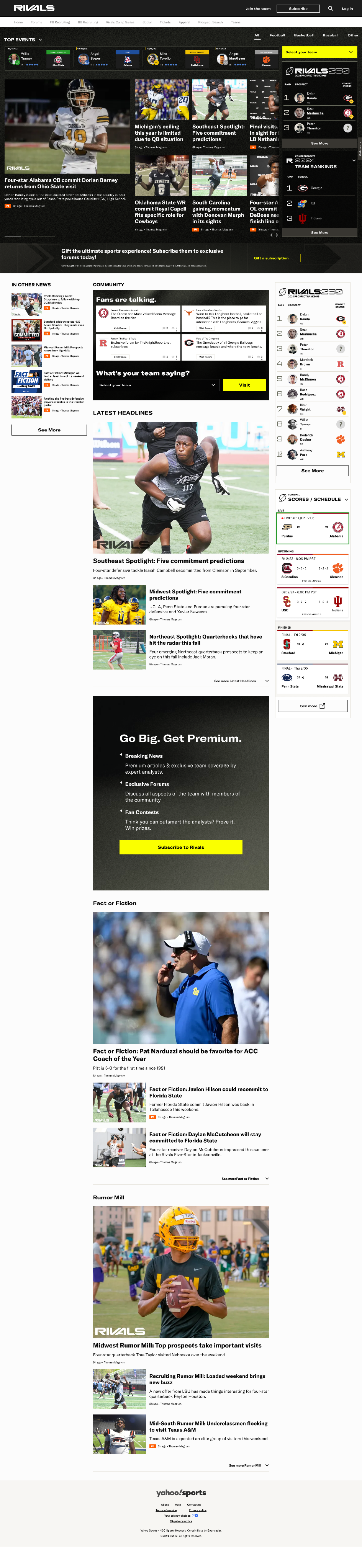
Key Design Highlights

Secondary Audience group
Casual Browsing

Site Specific
Customizable article sections

Primary Audience group
Statistical Widgets

Quick Access
Team Selection

Quick Access
Top Events

Primary Audience group
Highlight Articles

Quick Access
Forum Community
Business Goals
Value Propositions

200%
AD REVENUE GROWTH
year over year
15%
VISIT DURATION
on average

33%
BOUNCE RATE
compared to 46% in our competitors
7.8
UNIQUE VISITORS
compared to 4.96 in our competitors
Metrics
A comparative performance analysis revealed that while Rivals sees lower overall traffic and unique visits than peer platforms, it outperforms in key engagement metrics. Users are staying longer, viewing more pages, and returning more frequently—indicating a highly loyal audience. These findings shaped a strategy focused on amplifying discoverability and continuing to serve the platform’s most engaged users with greater content clarity and utility.
Strengths
- High visit duration (7:13) reflects strong user interest and time spent with content
- Loyal audience with 7.8 visits per unique visitor—well above the industry average
- More pages per visit (4.87) indicates effective internal linking and content flow
- Lowest bounce rate (33%) suggests users find value quickly and continue exploring
- Mobile-first behavior remains dominant (75% mobile traffic), affirming the need for performance-optimized, responsive design
- Growth opportunity: Lower overall monthly visits and reach highlight the need to boost content discoverability and attract new users
Next Project


Home
Product Design Case Study
Visual Design Case Study
Work
Other
VIEW FULL SKILLSET LIST
→
GET IN TOUCH
Bookings
CONTACT
ryan@madecollective.co
SOCIAL


LET'S MEET
→
PRODUCT DESIGN
CASE STUDY
The Client
Rivals is a leading digital platform for college sports recruiting news, rankings, and community-driven content. With a nationwide network of school-specific sites, Rivals delivers real-time coverage, in-depth analysis, and active forums where passionate fans and insiders connect. As a long-standing authority in high school and college athletics, Rivals serves a dedicated audience of sports enthusiasts, athletes, and recruiting experts.
The Ask
Rivals needed more than a facelift. Years of user data showed drop-offs, poor navigation, and missed opportunities to keep fans engaged. The business wanted a modern platform that could boost retention and open new revenue streams.
Criteria
- Scalable design system for a network of school-specific sites
- Clear definition of core user segments
- Unified and modernized brand identity across experiences
Constraints
- A truncated timeline of 6-months to deliver key pages
- A fast follow rollout of secondary pages to follow
- Lean team of engineers (front and backend) and only one designer.
Jump directly to the solution
SOLUTION
→
Audit and Analyze
I started by tearing down the existing experience. Usability gaps, clunky flows, and dated visuals all slowed users down. A competitive analysis confirmed what we suspected: Rivals had to evolve or risk losing relevance.
Value
Prevented churn by identifying friction before it cost more users.
Defining a Unified Design Narrative
Forums were the heartbeat of Rivals. I shaped the design narrative around “Join the Rivals Discussion.” Every design decision pointed toward elevating community engagement and making fans feel part of something bigger.
The Narrative
“Join the Rivals Discussion”
Value
Elevated the brand’s status by spotlighting authentic fan culture.


“Join the Rivals Discussion”

The Exploration
With a clear narrative anchored in community-driven engagement, I moved into the exploration phase to translate strategy into tangible design directions. This stage focused on rapid ideation, experimenting with layout systems, visual tone, and interaction patterns that could amplify the energy of real-time conversations. My goal was to balance the urgency and excitement of forum activity with a scalable, brand-aligned system—one that felt dynamic yet structured across devices and screen sizes.
Build to test
I ran A/B tests, prototyped layouts, and captured feedback from both users and stakeholders. The goal was to balance the energy of real-time forums with a system that could scale.
Value
Saved time by testing early and avoiding costly design reversals later.
User Reactions
Our testing revealed that content preferences varied based on user mood and personality, highlighting the importance of offering flexible experiences. However, the stat-driven layout consistently performed better for users seeking quick, glanceable information. Overall, participants favored the streamlined visual hierarchy and ease of navigation, indicating that clarity and content prioritization were key to improving engagement.
Participant heat maps
Takeaways
- Stat-driven layout was preferred for quick, efficient content scanning
- Article-driven layout appealed more to users in lean-back, in-depth reading modes
- Users appreciated the cleaner structure and improved content hierarchy
- Navigation was rated as more intuitive and user-friendly overall
- Personal preference highlighted the need for flexible entry points to content
- Clear takeaway: prioritizing scannable content supports daily and high-traffic usage
The Solution
The final design introduced a modular, content-forward system. Dashboards highlighted real-time updates, forums became more visible, and editorial tools gave publishers flexibility to tell better stories. An upsell section communicated Rivals’ unique value to new users.
We increased revenue by boosting engagement, ad inventory, and subscriptions.
The Result
The final design, shaped by user testing and community insights, delivered a modular system that works for both quick check-ins and deep dives. A new dashboard highlights real-time updates, trending content, and key stats, while flexible modules give publishers more control over storytelling. Forums were made more visible to spark activity, and an upsell section was added to showcase Rivals’ value to new users.
Key Design Highlights

Secondary Audience group
Casual Browsing

Site Specific
Customizable article sections

Primary Audience group
Statistical Widgets

Quick Access
Team Selection
Quick Access
Top Events
Primary Audience group
Highlight Articles

Quick Access
Forum Community

Business Goals
Value Propositions
Metrics
A comparative performance analysis revealed that while Rivals sees lower overall traffic and unique visits than peer platforms, it outperforms in key engagement metrics. Users are staying longer, viewing more pages, and returning more frequently—indicating a highly loyal audience. These findings shaped a strategy focused on amplifying discoverability and continuing to serve the platform’s most engaged users with greater content clarity and utility.
Strengths
- High visit duration (7:13) reflects strong user interest and time spent with content
- Loyal audience with 7.8 visits per unique visitor—well above the industry average
- More pages per visit (4.87) indicates effective internal linking and content flow
- Lowest bounce rate (33%) suggests users find value quickly and continue exploring
- Mobile-first behavior remains dominant (75% mobile traffic), affirming the need for performance-optimized, responsive design
- Growth opportunity: Lower overall monthly visits and reach highlight the need to boost content discoverability and attract new users

200%
AD REVENUE GROWTH
year over year
15%
VISIT DURATION
on average
33%
BOUNCE RATE
compared to 46% in our competitors
7.8
UNIQUE VISITORS
compared to 4.96 in our competitors
Next Project

Home
Product Design Case Study
Visual Design Case Study
Work
Other
VIEW FULL SKILLSET LIST
→
GET IN TOUCH
Bookings
CONTACT
ryan@madecollective.co
SOCIAL


Home
Case Studies
Work
Other
LET'S MEET

PRODUCT DESIGN
CASE STUDY
The Client
Rivals is a leading digital platform for college sports recruiting news, rankings, and community-driven content. With a nationwide network of school-specific sites, Rivals delivers real-time coverage, in-depth analysis, and active forums where passionate fans and insiders connect. As a long-standing authority in high school and college athletics, Rivals serves a dedicated audience of sports enthusiasts, athletes, and recruiting experts.
The Ask
Rivals needed more than a facelift. Years of user data showed drop-offs, poor navigation, and missed opportunities to keep fans engaged. The business wanted a modern platform that could boost retention and open new revenue streams.
Criteria
- Scalable design system for a network of school-specific sites
- Clear definition of core user segments
- Unified and modernized brand identity across experiences
Constraints
- A truncated timeline of 6-months to deliver key pages
- A fast follow rollout of secondary pages to follow
- Lean team of engineers (front and backend) and only one designer.
Jump directly to the solution
Audit and Analyze
I started by tearing down the existing experience. Usability gaps, clunky flows, and dated visuals all slowed users down. A competitive analysis confirmed what we suspected: Rivals had to evolve or risk losing relevance.
Value
Prevented churn by identifying friction before it cost more users.
Defining a Unified Design Narrative
Forums were the heartbeat of Rivals. I shaped the design narrative around “Join the Rivals Discussion.” Every design decision pointed toward elevating community engagement and making fans feel part of something bigger.
The Narrative
“Join the Rivals Discussion”
Value
Elevated the brand’s status by spotlighting authentic fan culture.
“Join the Rivals Discussion”
The Exploration
With a clear narrative anchored in community-driven engagement, I moved into the exploration phase to translate strategy into tangible design directions. This stage focused on rapid ideation, experimenting with layout systems, visual tone, and interaction patterns that could amplify the energy of real-time conversations. My goal was to balance the urgency and excitement of forum activity with a scalable, brand-aligned system—one that felt dynamic yet structured across devices and screen sizes.
Build to test
I ran A/B tests, prototyped layouts, and captured feedback from both users and stakeholders. The goal was to balance the energy of real-time forums with a system that could scale.
Value
Saved time by testing early and avoiding costly design reversals later.
User Reactions
Our testing revealed that content preferences varied based on user mood and personality, highlighting the importance of offering flexible experiences. However, the stat-driven layout consistently performed better for users seeking quick, glanceable information. Overall, participants favored the streamlined visual hierarchy and ease of navigation, indicating that clarity and content prioritization were key to improving engagement.
Participant heat maps
Takeaways
- Stat-driven layout was preferred for quick, efficient content scanning
- Article-driven layout appealed more to users in lean-back, in-depth reading modes
- Users appreciated the cleaner structure and improved content hierarchy
- Navigation was rated as more intuitive and user-friendly overall
- Personal preference highlighted the need for flexible entry points to content
- Clear takeaway: prioritizing scannable content supports daily and high-traffic usage
The Solution
The final design introduced a modular, content-forward system. Dashboards highlighted real-time updates, forums became more visible, and editorial tools gave publishers flexibility to tell better stories. An upsell section communicated Rivals’ unique value to new users.
We increased revenue by boosting engagement, ad inventory, and subscriptions.

The Result
The final design, shaped by user testing and community insights, delivered a modular system that works for both quick check-ins and deep dives. A new dashboard highlights real-time updates, trending content, and key stats, while flexible modules give publishers more control over storytelling. Forums were made more visible to spark activity, and an upsell section was added to showcase Rivals’ value to new users.
Key Design Highlights
Secondary Audience group
Casual Browsing

Site Specific
Customizable article sections

Primary Audience group
Statistical Widgets

Quick Access
Team Selection
Quick Access
Top Events
Primary Audience group
Highlight Articles

Quick Access
Forum Community
Business Goals
Value Propositions
Metrics
A comparative performance analysis revealed that while Rivals sees lower overall traffic and unique visits than peer platforms, it outperforms in key engagement metrics. Users are staying longer, viewing more pages, and returning more frequently—indicating a highly loyal audience. These findings shaped a strategy focused on amplifying discoverability and continuing to serve the platform’s most engaged users with greater content clarity and utility.
Strengths
- High visit duration (7:13) reflects strong user interest and time spent with content
- Loyal audience with 7.8 visits per unique visitor—well above the industry average
- More pages per visit (4.87) indicates effective internal linking and content flow
- Lowest bounce rate (33%) suggests users find value quickly and continue exploring
- Mobile-first behavior remains dominant (75% mobile traffic), affirming the need for performance-optimized, responsive design
- Growth opportunity: Lower overall monthly visits and reach highlight the need to boost content discoverability and attract new users
200%
AD REVENUE GROWTH
year over year
15%
VISIT DURATION
on average
33%
BOUNCE RATE
compared to 46% in our competitors
7.8
UNIQUE VISITORS
compared to 4.96 in our competitors
Next Project

Home
Product Design Case Study
Visual Design Case Study
Work
Other
VIEW FULL SKILLSET LIST
→
GET IN TOUCH
Bookings
CONTACT
ryan@madecollective.co
SOCIAL

Home
Case Studies
Work
Other
LET'S MEET
PRODUCT DESIGN
CASE STUDY
The Client
Rivals is a leading digital platform for college sports recruiting news, rankings, and community-driven content. With a nationwide network of school-specific sites, Rivals delivers real-time coverage, in-depth analysis, and active forums where passionate fans and insiders connect. As a long-standing authority in high school and college athletics, Rivals serves a dedicated audience of sports enthusiasts, athletes, and recruiting experts.
The Ask
Rivals needed more than a facelift. Years of user data showed drop-offs, poor navigation, and missed opportunities to keep fans engaged. The business wanted a modern platform that could boost retention and open new revenue streams.
Criteria
- Scalable design system for a network of school-specific sites
- Clear definition of core user segments
- Unified and modernized brand identity across experiences
Constraints
- A truncated timeline of 6-months to deliver key pages
- A fast follow rollout of secondary pages to follow
- Lean team of engineers (front and backend) and only one designer.
Jump directly to the solution
Audit and Analyze
I started by tearing down the existing experience. Usability gaps, clunky flows, and dated visuals all slowed users down. A competitive analysis confirmed what we suspected: Rivals had to evolve or risk losing relevance.
Value
Prevented churn by identifying friction before it cost more users.
Defining a Unified Design Narrative
Forums were the heartbeat of Rivals. I shaped the design narrative around “Join the Rivals Discussion.” Every design decision pointed toward elevating community engagement and making fans feel part of something bigger.
The Narrative
“Join the Rivals Discussion”
Value
Elevated the brand’s status by spotlighting authentic fan culture.
“Join the Rivals Discussion”
The Exploration
With a clear narrative anchored in community-driven engagement, I moved into the exploration phase to translate strategy into tangible design directions. This stage focused on rapid ideation, experimenting with layout systems, visual tone, and interaction patterns that could amplify the energy of real-time conversations. My goal was to balance the urgency and excitement of forum activity with a scalable, brand-aligned system—one that felt dynamic yet structured across devices and screen sizes.
Build to test
I ran A/B tests, prototyped layouts, and captured feedback from both users and stakeholders. The goal was to balance the energy of real-time forums with a system that could scale.
Value
Saved time by testing early and avoiding costly design reversals later.
User Reactions
Our testing revealed that content preferences varied based on user mood and personality, highlighting the importance of offering flexible experiences. However, the stat-driven layout consistently performed better for users seeking quick, glanceable information. Overall, participants favored the streamlined visual hierarchy and ease of navigation, indicating that clarity and content prioritization were key to improving engagement.
Participant heat maps
Takeaways
- Stat-driven layout was preferred for quick, efficient content scanning
- Article-driven layout appealed more to users in lean-back, in-depth reading modes
- Users appreciated the cleaner structure and improved content hierarchy
- Navigation was rated as more intuitive and user-friendly overall
- Personal preference highlighted the need for flexible entry points to content
- Clear takeaway: prioritizing scannable content supports daily and high-traffic usage
The Solution
The final design introduced a modular, content-forward system. Dashboards highlighted real-time updates, forums became more visible, and editorial tools gave publishers flexibility to tell better stories. An upsell section communicated Rivals’ unique value to new users.
We increased revenue by boosting engagement, ad inventory, and subscriptions.
The Result
The final design, shaped by user testing and community insights, delivered a modular system that works for both quick check-ins and deep dives. A new dashboard highlights real-time updates, trending content, and key stats, while flexible modules give publishers more control over storytelling. Forums were made more visible to spark activity, and an upsell section was added to showcase Rivals’ value to new users.
Key Design Highlights
Secondary Audience group
Casual Browsing
Site Specific
Customizable article sections
Primary Audience group
Statistical Widgets
Quick Access
Team Selection
Quick Access
Top Events
Primary Audience group
Highlight Articles
Quick Access
Forum Community
Business Goals
Value Propositions
Metrics
A comparative performance analysis revealed that while Rivals sees lower overall traffic and unique visits than peer platforms, it outperforms in key engagement metrics. Users are staying longer, viewing more pages, and returning more frequently—indicating a highly loyal audience. These findings shaped a strategy focused on amplifying discoverability and continuing to serve the platform’s most engaged users with greater content clarity and utility.
Strengths
- High visit duration (7:13) reflects strong user interest and time spent with content
- Loyal audience with 7.8 visits per unique visitor—well above the industry average
- More pages per visit (4.87) indicates effective internal linking and content flow
- Lowest bounce rate (33%) suggests users find value quickly and continue exploring
- Mobile-first behavior remains dominant (75% mobile traffic), affirming the need for performance-optimized, responsive design
- Growth opportunity: Lower overall monthly visits and reach highlight the need to boost content discoverability and attract new users
200%
AD REVENUE GROWTH
year over year
15%
VISIT DURATION
on average
33%
BOUNCE RATE
compared to 46% in our competitors
7.8
UNIQUE VISITORS
compared to 4.96 in our competitors
Next Project

Home
Product Design Case Study
Visual Design Case Study
Work
Other
VIEW FULL SKILLSET LIST
→
GET IN TOUCH
Bookings
CONTACT
ryan@madecollective.co
SOCIAL