LET'S MEET
→


VISUAL DESIGN
CASE STUDY
Objective
Define and translate Rivals’ new “gritty” identity into a digital system that could scale across fan sites and use cases.
Translating Brand into Experience
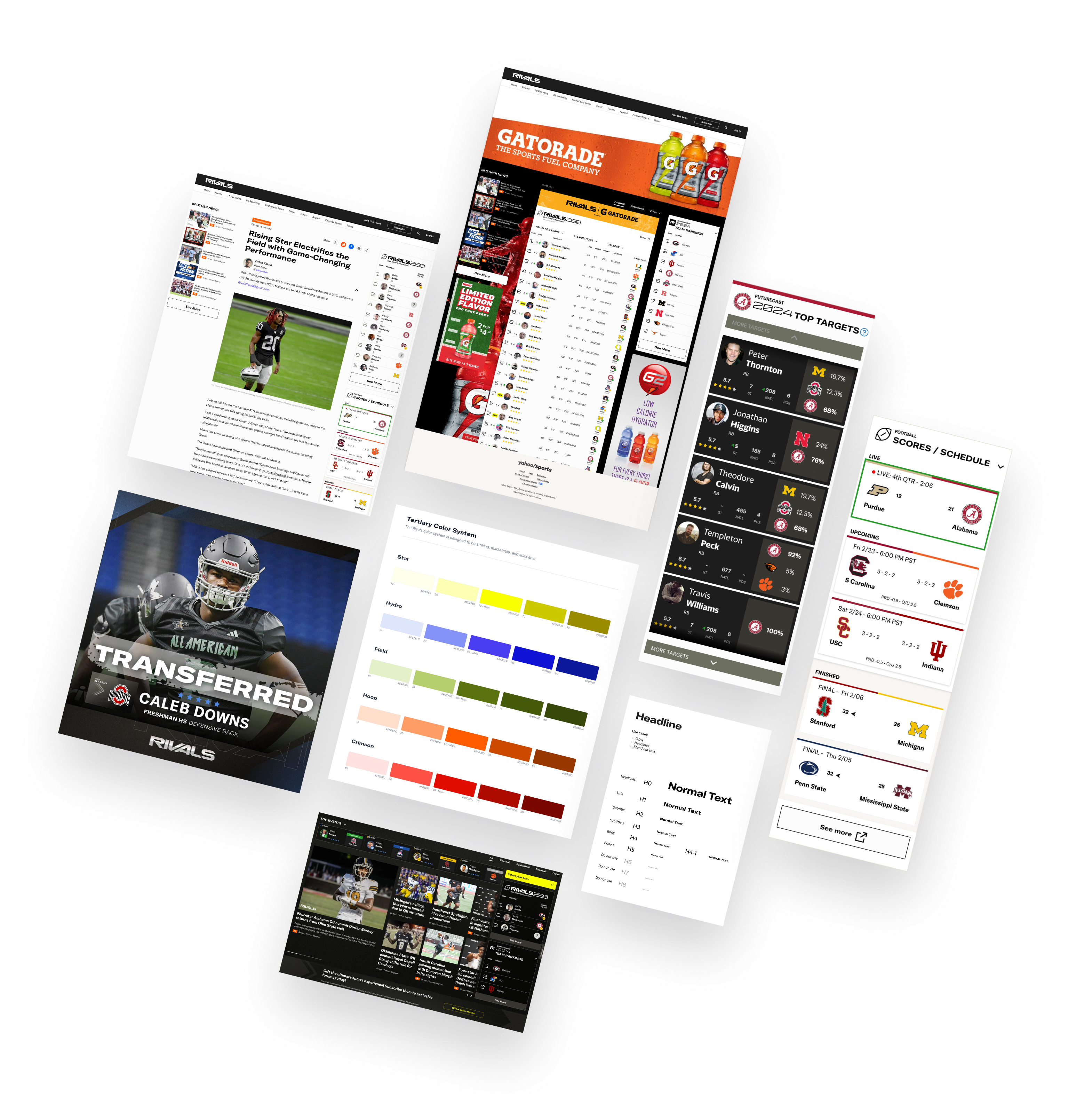
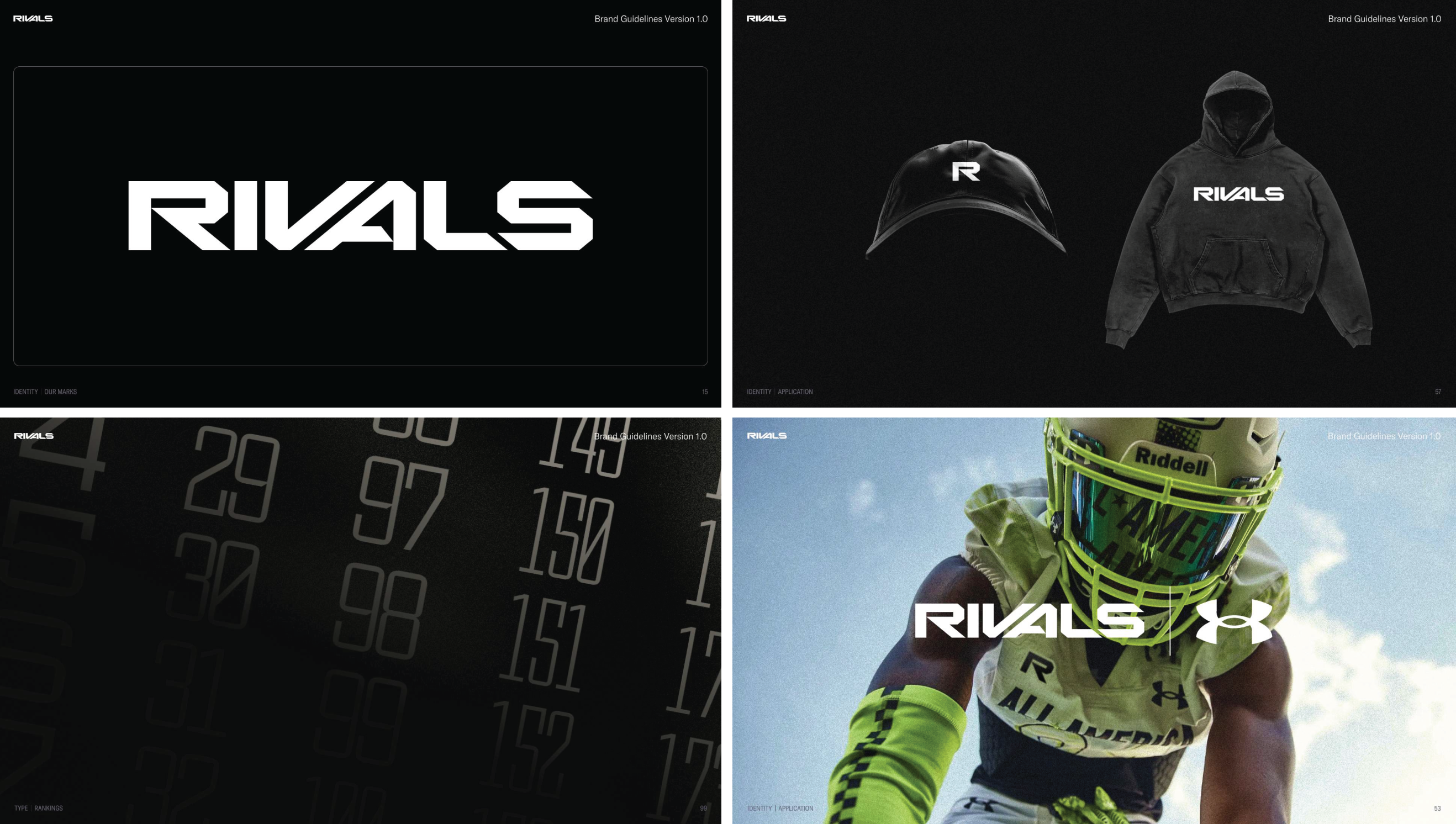
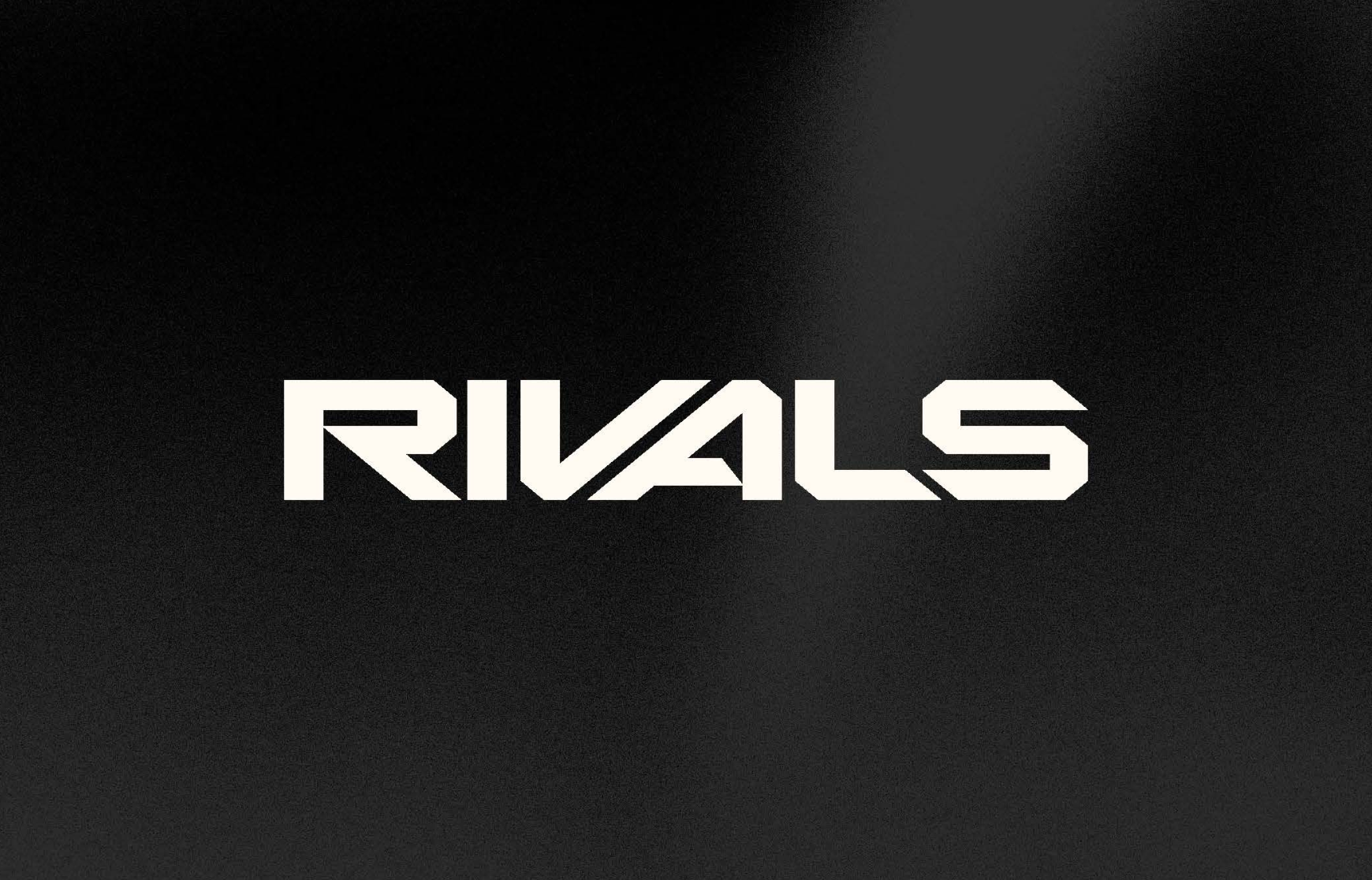
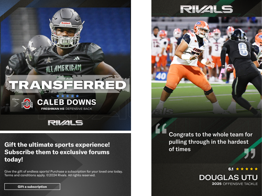
Rivals underwent a major identity shift during my time on the project. The original design leaned toward a broad, audience-friendly style with oversized typography and bright tones. After the rebrand, the focus moved to a grittier aesthetic that reflected the intensity and competitive spirit of team sports. From this shift, the theme of “athletes amplified” emerged. That became the emotional foundation I translated into every detail of the product experience, ensuring the brand was consistently expressed across interactions, layouts, and components.
Crafting a Visual Language
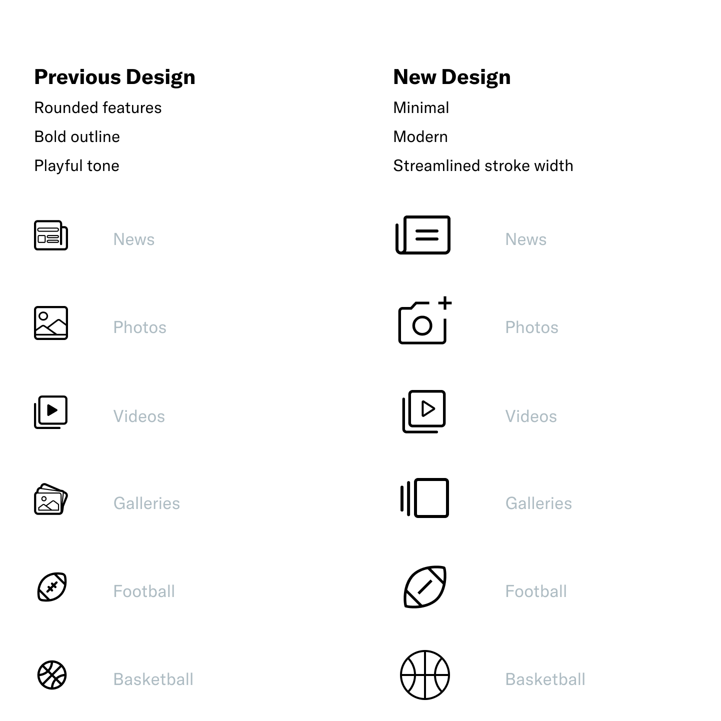
Every detail mattered. Icon sets, box angles, rounded edges, and spacing were all aligned to the gritty aesthetic.
Value: Prevented brand dilution by keeping details consistent across touchpoints.
Designing Grit with Flexibility
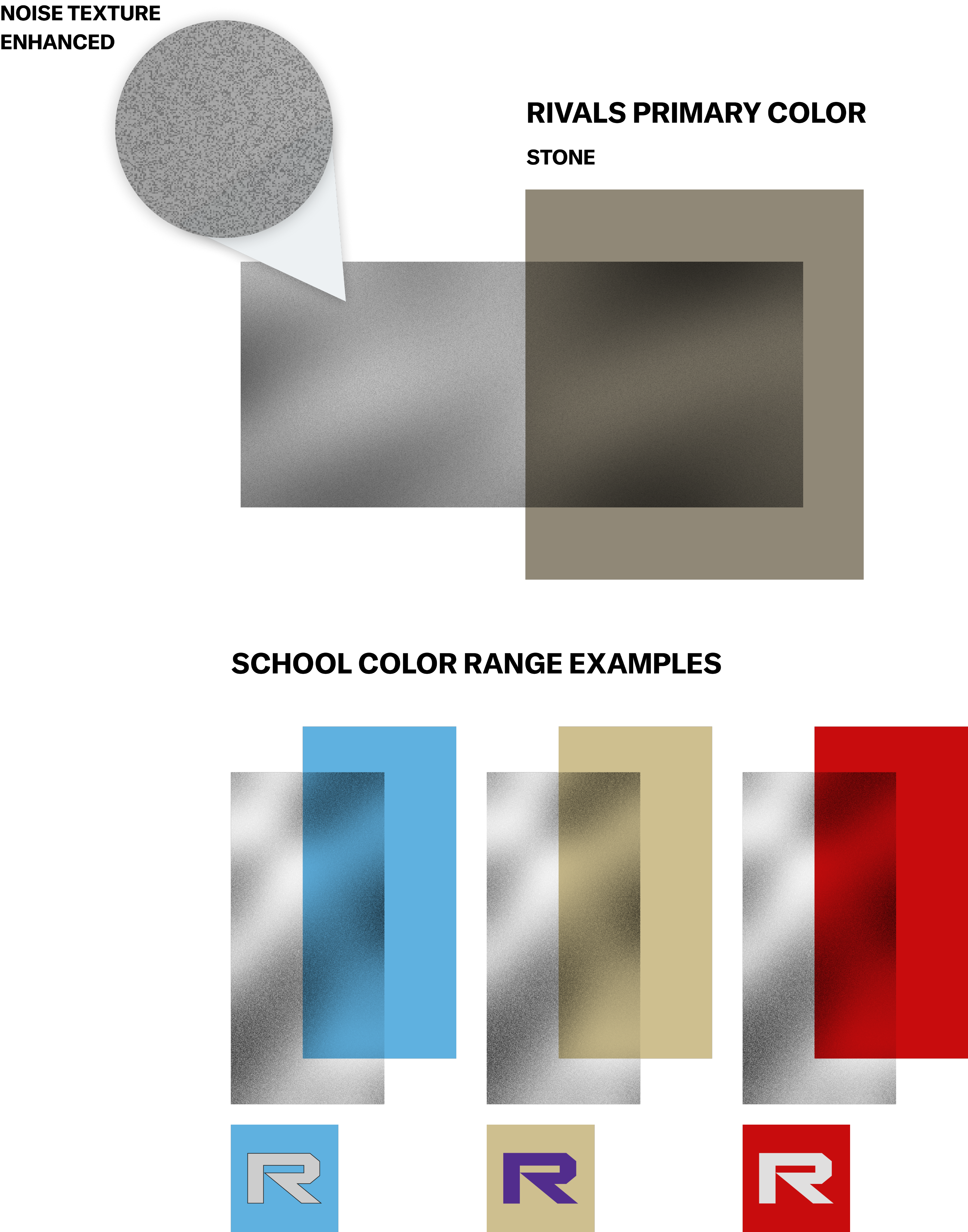
I designed textured backgrounds and a noise-filter gradient to capture “grit.” The real challenge was scaling this across dozens of college team sites with their own colors. I built an automated approach to keep things consistent.
Value: Saved time by automating brand elements instead of hand-tuning each site.
Supporting Marks
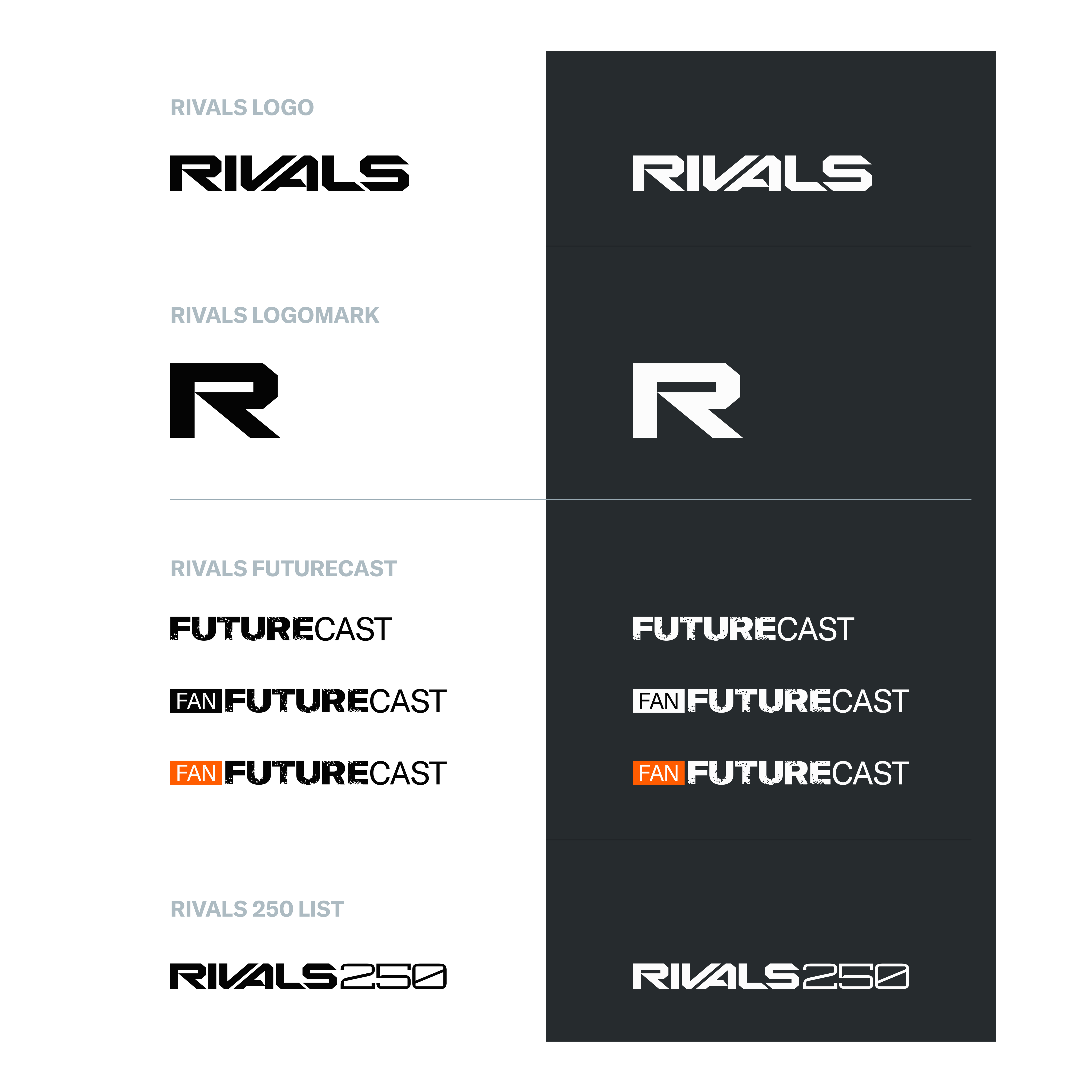
For feature areas like FutureCast, I created supporting logomarks that drew from Rivals’ core identity but added grit and motion.
Value: Elevated the brand by giving sub-features a unique, action-oriented identity.
Iconography Exploration
Color Strategy
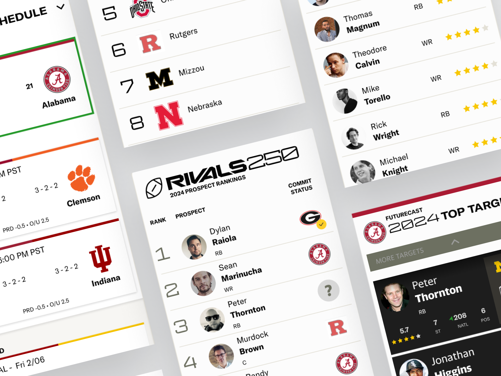
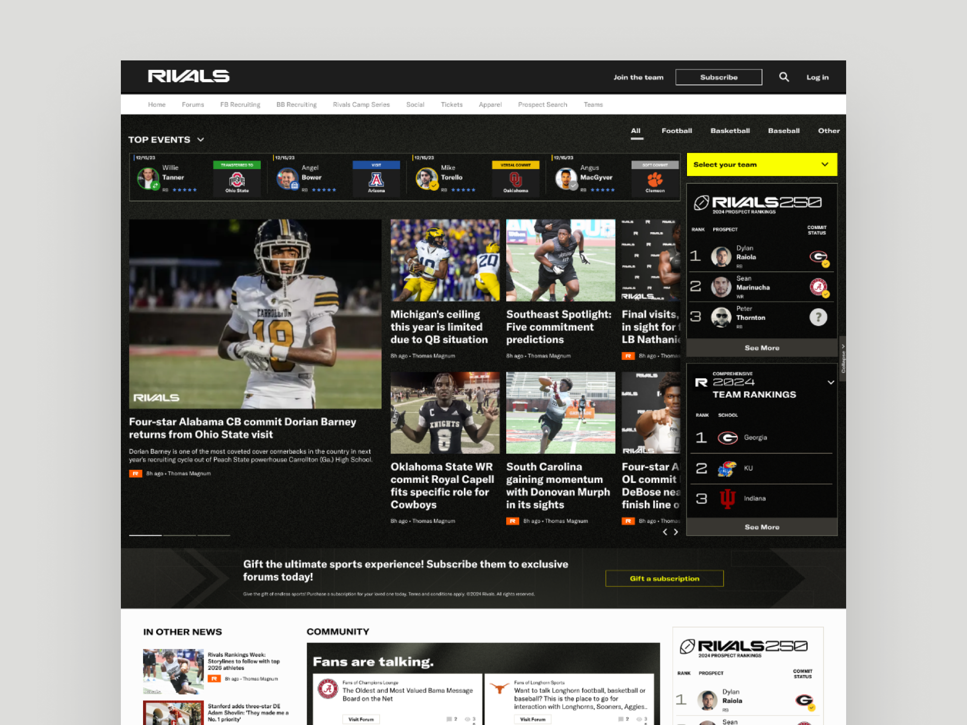
The updated Rivals color palette was designed to serve as a strong foundation for every sub fan site while avoiding conflicts with individual school colors. We established a dark aesthetic that reinforced the Rivals brand identity and extended naturally into merchandise, live events, and promotional materials. My role was to translate this palette into the digital experience, ensuring it supported the brand’s gritty tone while remaining flexible enough to scale across a wide range of applications.
Dark Mode with Purpose
With Abyss Black as the primary color, I explored the option of designing Rivals entirely in dark mode. Research showed that while dark interfaces can reduce eye strain in low-light settings, they often compromise readability of UI elements and long-form editorial content. Most established editorial experiences also continue to favor light backgrounds for accessibility and clarity. Based on these insights, I implemented a split approach. Marketing and promotional sections used dark backgrounds to emphasize mood and brand identity, while article, statistical, and admin pages retained a light backdrop to support function and readability.
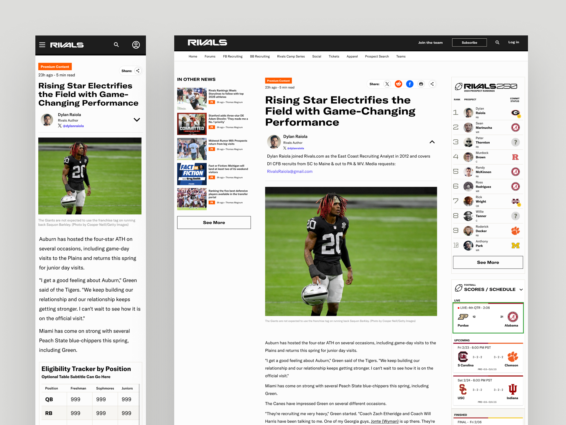
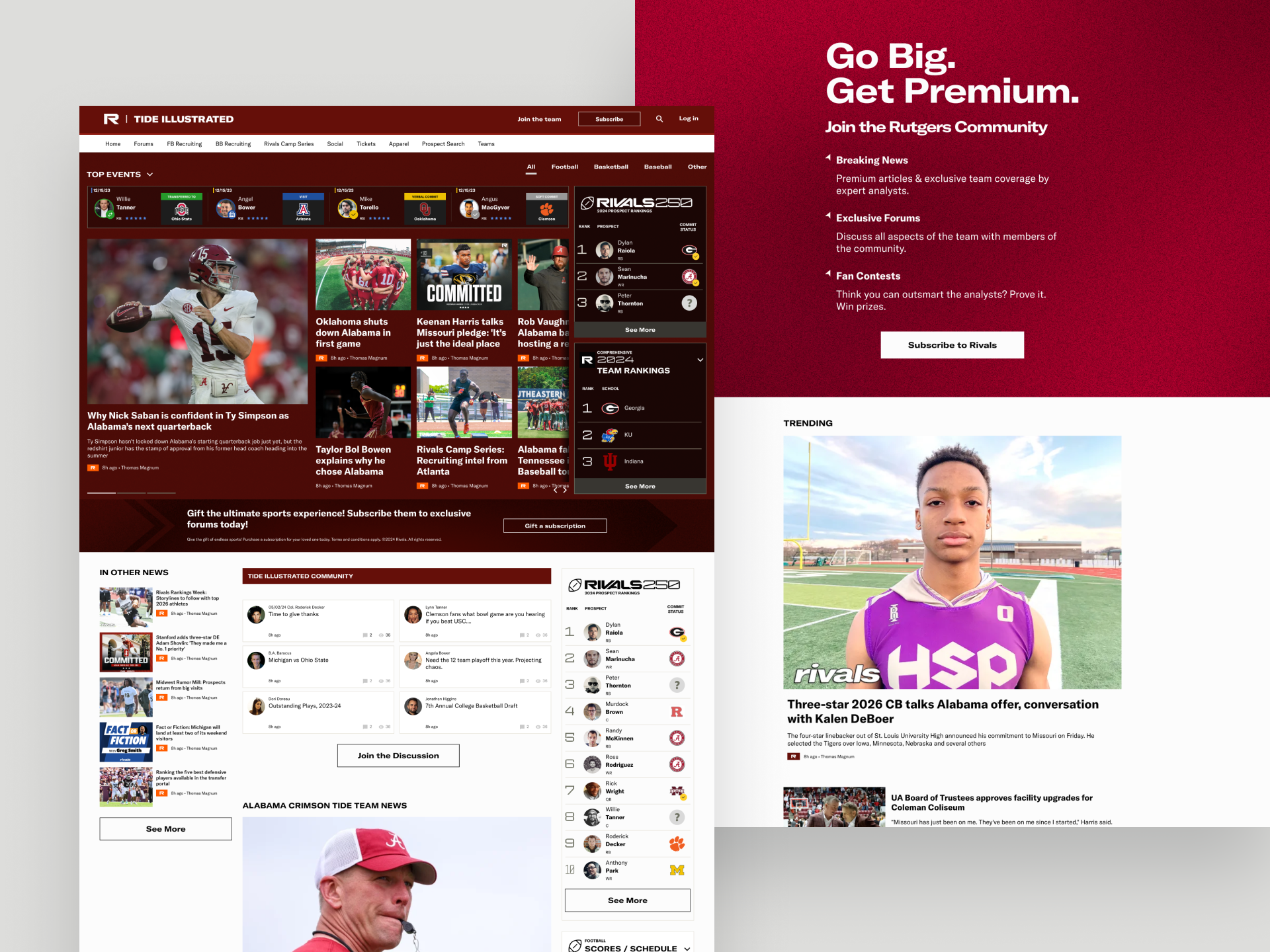
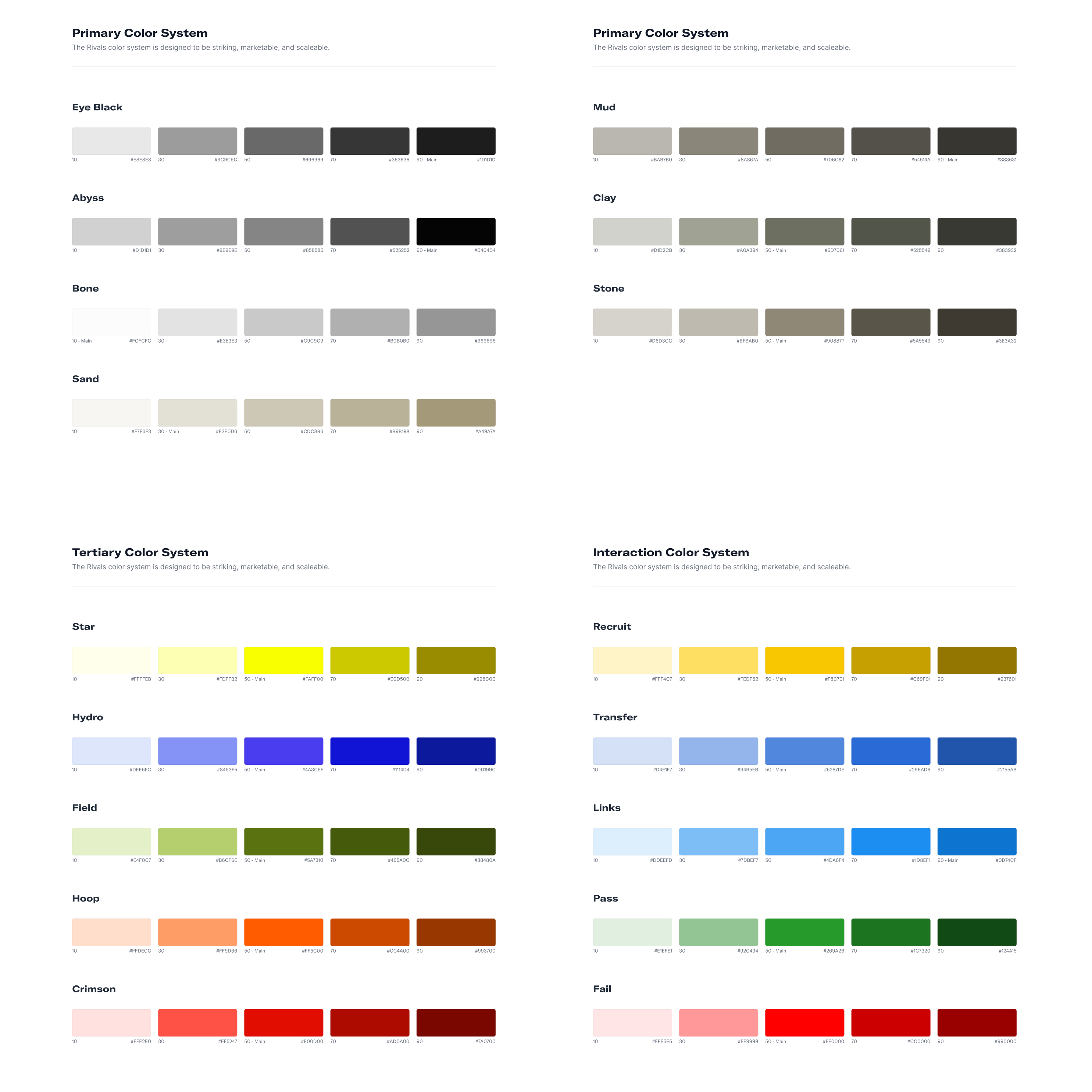
Designing a Digital Color Family
I developed a dark, flexible palette centered on “Abyss Black.” For accessibility, I expanded each color into tonal ranges tested against AA contrast standards.
Value: Prevented usability issues by designing for accessibility and clarity.
Impact
The rebrand created a visual system that was bold, flexible, and revenue-ready. The gritty look carried across digital, merchandise, and live events while improving the user experience online.
Value: Made money by strengthening the brand identity and creating consistency that supports future monetization.
Next Project

Home
Product Design Case Study
Visual Design Case Study
Work
Other
VIEW FULL SKILLSET LIST
→
GET IN TOUCH
Bookings
CONTACT
ryan@madecollective.co
SOCIAL


LET'S MEET
→
VISUAL DESIGN
CASE STUDY
Objective
Define and translate Rivals’ new “gritty” identity into a digital system that could scale across fan sites and use cases.
Translating Brand into Experience
Rivals underwent a major identity shift during my time on the project. The original design leaned toward a broad, audience-friendly style with oversized typography and bright tones. After the rebrand, the focus moved to a grittier aesthetic that reflected the intensity and competitive spirit of team sports. From this shift, the theme of “athletes amplified” emerged. That became the emotional foundation I translated into every detail of the product experience, ensuring the brand was consistently expressed across interactions, layouts, and components.
Crafting a Visual Language
Every detail mattered. Icon sets, box angles, rounded edges, and spacing were all aligned to the gritty aesthetic.
Value: Prevented brand dilution by keeping details consistent across touchpoints.
Designing Grit with Flexibility
I designed textured backgrounds and a noise-filter gradient to capture “grit.” The real challenge was scaling this across dozens of college team sites with their own colors. I built an automated approach to keep things consistent.
Value: Saved time by automating brand elements instead of hand-tuning each site.
Supporting Marks
For feature areas like FutureCast, I created supporting logomarks that drew from Rivals’ core identity but added grit and motion.
Value: Elevated the brand by giving sub-features a unique, action-oriented identity.
Iconography Exploration
Color Strategy
The updated Rivals color palette was designed to serve as a strong foundation for every sub fan site while avoiding conflicts with individual school colors. We established a dark aesthetic that reinforced the Rivals brand identity and extended naturally into merchandise, live events, and promotional materials. My role was to translate this palette into the digital experience, ensuring it supported the brand’s gritty tone while remaining flexible enough to scale across a wide range of applications.
Dark Mode with Purpose
With Abyss Black as the primary color, I explored the option of designing Rivals entirely in dark mode. Research showed that while dark interfaces can reduce eye strain in low-light settings, they often compromise readability of UI elements and long-form editorial content. Most established editorial experiences also continue to favor light backgrounds for accessibility and clarity. Based on these insights, I implemented a split approach. Marketing and promotional sections used dark backgrounds to emphasize mood and brand identity, while article, statistical, and admin pages retained a light backdrop to support function and readability.
Designing a Digital Color Family
I developed a dark, flexible palette centered on “Abyss Black.” For accessibility, I expanded each color into tonal ranges tested against AA contrast standards.
Value: Prevented usability issues by designing for accessibility and clarity.
Impact
The rebrand created a visual system that was bold, flexible, and revenue-ready. The gritty look carried across digital, merchandise, and live events while improving the user experience online.
Value: Made money by strengthening the brand identity and creating consistency that supports future monetization.
Next Project

Home
Product Design Case Study
Visual Design Case Study
Work
Other
VIEW FULL SKILLSET LIST
→
GET IN TOUCH
Bookings
CONTACT
ryan@madecollective.co
SOCIAL


Home
Case Studies
Work
Other
LET'S MEET

VISUAL DESIGN
CASE STUDY
Objective
Define and translate Rivals’ new “gritty” identity into a digital system that could scale across fan sites and use cases.
Translating Brand into Experience
Rivals underwent a major identity shift during my time on the project. The original design leaned toward a broad, audience-friendly style with oversized typography and bright tones. After the rebrand, the focus moved to a grittier aesthetic that reflected the intensity and competitive spirit of team sports. From this shift, the theme of “athletes amplified” emerged. That became the emotional foundation I translated into every detail of the product experience, ensuring the brand was consistently expressed across interactions, layouts, and components.
Crafting a Visual Language
Every detail mattered. Icon sets, box angles, rounded edges, and spacing were all aligned to the gritty aesthetic.
Value: Prevented brand dilution by keeping details consistent across touchpoints.
Designing Grit with Flexibility
I designed textured backgrounds and a noise-filter gradient to capture “grit.” The real challenge was scaling this across dozens of college team sites with their own colors. I built an automated approach to keep things consistent.
Value: Saved time by automating brand elements instead of hand-tuning each site.
Supporting Marks
For feature areas like FutureCast, I created supporting logomarks that drew from Rivals’ core identity but added grit and motion.
Value: Elevated the brand by giving sub-features a unique, action-oriented identity.
Iconography Exploration
Color Strategy
The updated Rivals color palette was designed to serve as a strong foundation for every sub fan site while avoiding conflicts with individual school colors. We established a dark aesthetic that reinforced the Rivals brand identity and extended naturally into merchandise, live events, and promotional materials. My role was to translate this palette into the digital experience, ensuring it supported the brand’s gritty tone while remaining flexible enough to scale across a wide range of applications.
Dark Mode with Purpose
With Abyss Black as the primary color, I explored the option of designing Rivals entirely in dark mode. Research showed that while dark interfaces can reduce eye strain in low-light settings, they often compromise readability of UI elements and long-form editorial content. Most established editorial experiences also continue to favor light backgrounds for accessibility and clarity. Based on these insights, I implemented a split approach. Marketing and promotional sections used dark backgrounds to emphasize mood and brand identity, while article, statistical, and admin pages retained a light backdrop to support function and readability.
Designing a Digital Color Family
I developed a dark, flexible palette centered on “Abyss Black.” For accessibility, I expanded each color into tonal ranges tested against AA contrast standards.
Value: Prevented usability issues by designing for accessibility and clarity.
Impact
The rebrand created a visual system that was bold, flexible, and revenue-ready. The gritty look carried across digital, merchandise, and live events while improving the user experience online.
Value: Made money by strengthening the brand identity and creating consistency that supports future monetization.
Next Project

Home
Product Design Case Study
Visual Design Case Study
Work
Other
VIEW FULL SKILLSET LIST
→
GET IN TOUCH
Bookings
CONTACT
ryan@madecollective.co
SOCIAL
